Devlog 4: Presentation / Graphics
Devlog 4: Presentation / Graphics
Welcome to another devlog 😊. Here I’ll be giving you a leisurely tour of the fabulous sprites that I’ve created to give my game a bit of extra charm and visual coherence. I’m proud to say that I’ve created new sprites for my environment, player, and enemies. The characters all have at least 1 spritesheet animation as well! I created all the sprites using an online tool called piskel, which allows you to duplicate pixels between sprite sheets, which is handy for creating sprite animations. It’s a great tool for simple sprites like the ones below.
Meet the cast!
Grandma
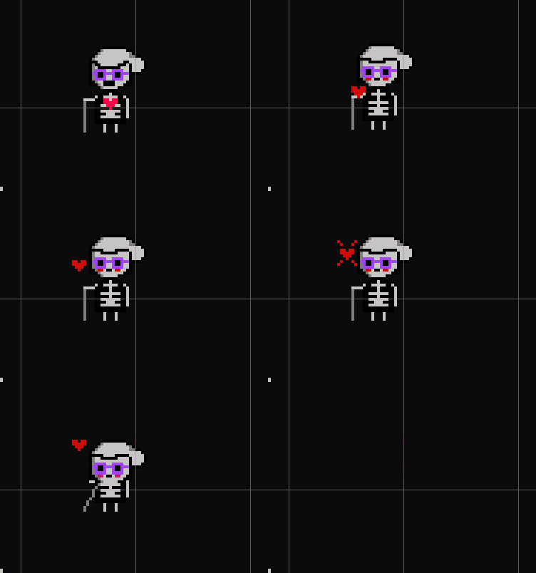
Above is the new and improved Grandma enemy type. I gave her a tied-back bun, some groovy spectacles, and a walking stick. The animation above plays when her soul is released – I hope you find it as cute as I do 😊.
Skeleton
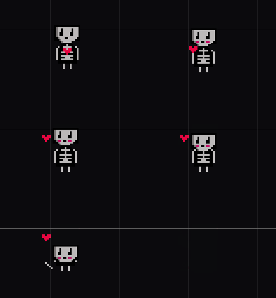
The skeleton follows the same motif as the Grandma – a largely black,white, and grey aesthetic with a red heart in its chest. I like the visual design of having a mostly black and white world, with single points of colour to draw the eye and reinforce the theme. Once again, this is the animation that plays when the skeleton is put to rest. When the skeleton attacks, it looks like this…
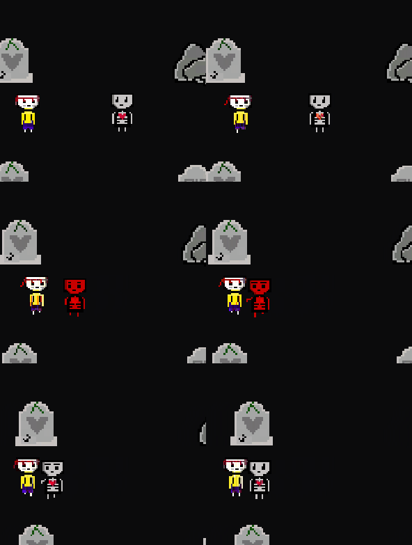
Not very scary, is it? I decided that a simple nudge-like movement was best because of its simple implementation and my lack of artistic ability. The plan has always been that the undead enemies would be a zero to 1 out of 10 for scariness, and as high as possible on the adorable scale. So, making the skeleton have a pretty pathetic attack fits quite well!
The player
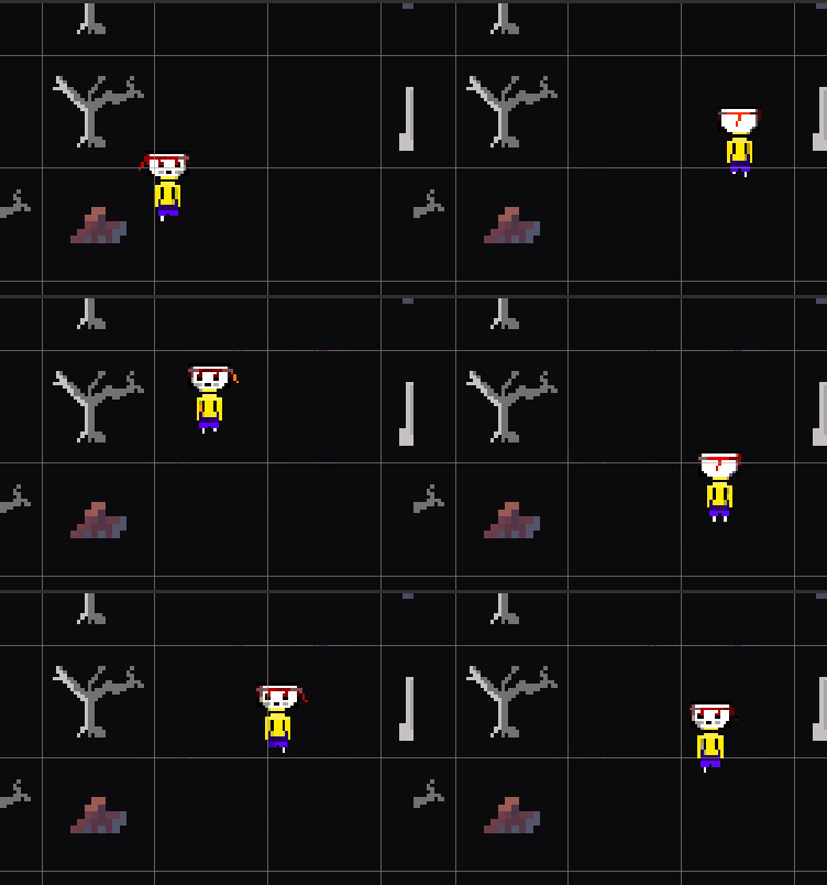
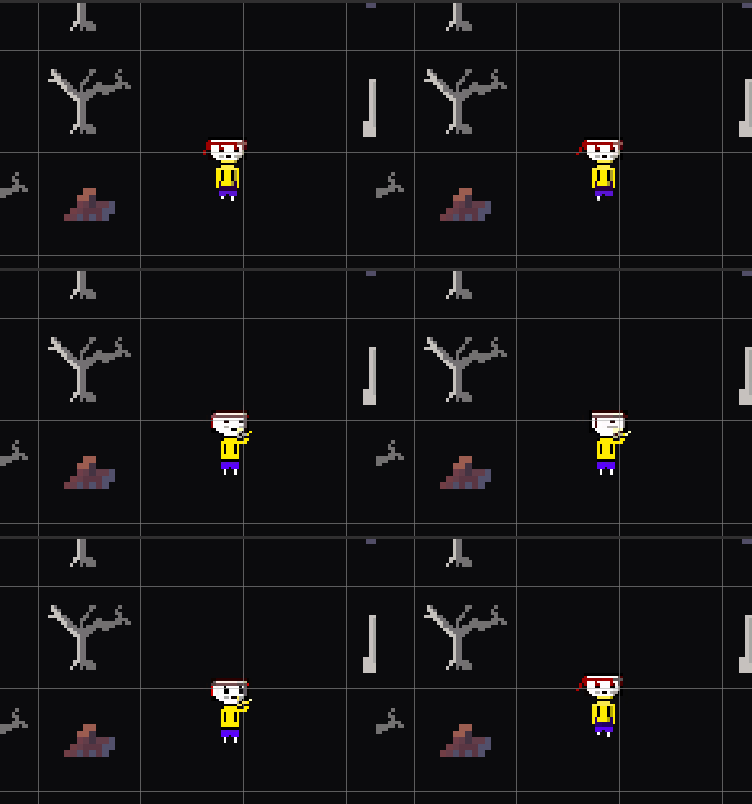
And here is the new player sprite. I’m on the fence about this one – there is a lot more colour than in the rest of the characters, and I would like the player to have a closer aesthetic match to them. I chose the bright yellow shirt because I wanted the player to be a drop of colour in a drab world. You can see here that the player sprite is based on 4 directional movement. I gave them a red headband to float about in the wind. I like the cute touch of the child putting on a headband to go face danger, even though they won't be fighting.
The player's hug is pretty central to the entire game, so of course it has an animation as well. It ended up being a hug and smooch combo!
The environment
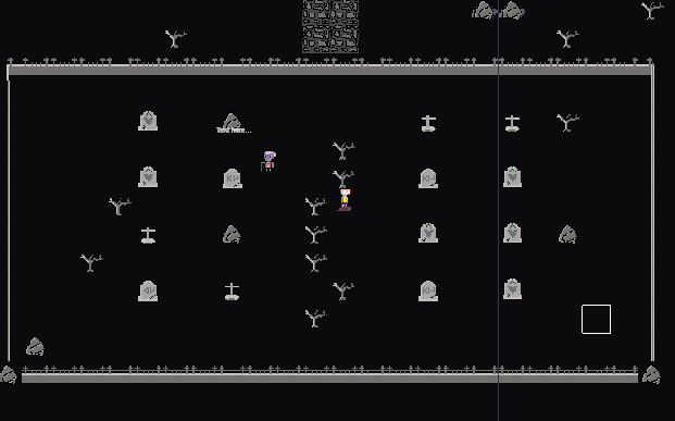
Here is the new environment dotted with rocks, tombstones, and dead trees. Let’s move in for a closer look
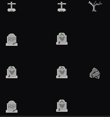
The burial markers have three different varieties: a cross, a cracked tombstone with lettering, and a heart-marked tombstone with ivy crawling across its surface. I thought that including hearts on the tombstones was a fun way of dovetailing the environment with the theme of the game. Otherwise, the tombstones might have been too dreary for the light tone of the game.
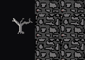
These cobblestones are a work in progress. In my concept statement I mentioned that I didn’t want the environment to feel too blocky. As you can see from my sprites, the blockiness is definitely there! I plan on redoing this sprite so that the cobblestones don’t form a perfect square. Keeping the edges rounded and transparent should give a nicer look, as long as I combine multiple sprites to make a central rounded walkway.
Feedback from Testers
Feedback has been very positive, however it was pointed out that the hug is very 'floaty' at the moment, meaning that the animation is unimpeded by the player movement and so you are encouraged to spam the attack button. In order to sell the hug visually, I should lock the player movement or at least slow it, so that it really feels like we are going in for a slow, thoughtful hug. This would be much better than the current situation where the player can zip around the map spamming the button and watching the player character flail their arms about!
And...that's it!
What do you think of the new look? In the next devlog we'll be talking about the UI. I hope to see you there :)
References
The Piskel sprite editor: https://www.piskelapp.com/
Get Zombie Hugger
Zombie Hugger
Hug the undead, befriend the elderly, try not to die.
More posts
- Devlog 6: Changes from FeedbackOct 16, 2022
- Devlog 5: UI and PolishOct 09, 2022
- Devlog 3: Enemy AIOct 09, 2022
- Game TestingOct 05, 2022
- Devlog 2: Level Blocking and Limited VisualsSep 20, 2022
- Delog 1: MovementSep 20, 2022
- Game ConceptAug 27, 2022
Leave a comment
Log in with itch.io to leave a comment.